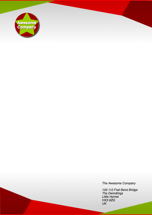
Creating fancy letterheaded paper
If you want to make the right impression, writing a letter on nice letterheaded paper can be a really good start. In this assessment we'll challenge you to create an online template to achieve such a look.
| Prerequisites: | Before attempting this assessment you should have already worked through all the articles in this module. |
|---|---|
| Objective: | To test comprehension of CSS box model, and other box-related features such as implementing backgrounds. |
Starting point
To get this assessment started, you should:
- Make local copies of the HTML and CSS — save them as
index.htmlandstyle.cssin a new directory. - Save local copies of the top, bottom and logo images in the same directory as your code files.
Alternatively, you could use an online editor such as CodePen, JSFiddle, or Glitch. You could paste the HTML and fill in the CSS into one of these online editors.
Note: If you get stuck, you can reach out to us in one of our communication channels.
Project brief
You have been given the files needed to create a letterheaded paper template. You just need to put the files together. To get there, you need to:
The main letter
- Apply the CSS to the HTML.
- Add a background declaration to the letter that:
- Fixes the top image to the top of the letter
- Fixes the bottom image to the bottom of the letter
- Adds a semi-transparent gradient over the top of both of the previous backgrounds that gives the letter a bit of texture. Make it slightly dark right near the top and bottom, but completely transparent for a large part of the center.
- Add another background declaration that just adds the top image to the top of the letter, as a fallback for browsers that don't support the previous declaration.
- Add a white background color to the letter.
- Add a 1mm top and bottom solid border to the letter, in a color that is in keeping with the rest of the color scheme.
The logo
- To the h1, add the logo as a background image.
- Add a filter to the logo to give it a subtle drop shadow.
- Now comment out the filter and implement the drop shadow in a different (slightly more cross-browser compatible) way, which still follows the shape of the round image.
Hints and tips
- Remember that you can create a fallback for older browsers by putting the fallback version of a declaration first, followed by the version that works across newer browsers only. Older browsers will apply the first declaration and ignore the second one, whereas newer browsers will apply the first one, then override it with the second one.
- Feel free to create your own graphics for the assessment if you wish.
